

A Manhattan Beach Office Renovation
The challenge:
Renovate a dark and cramped 2500 sq ft. office to make it a cool and calm place people would like to hang out... in one month's time.
The Process:
When getting into the world of interiors, if someone would have told me, "Designing a Recovery/Outpatient Center can be really fun!" I probably would have laughed a bit. (Okay, a lot.) An 'outpatient center' sounds to me like a big ol' "hospital" and there's nothing that sounds fun about that. That was until I met Mike, of course. Mike's been in the world of Recovery for a while now and it's clear he knows what he's doing. I can't imagine there are a lot of recovery center owners out there that know how important a comfortable environment is, but Mike certainly does. And I was darn glad called he reached out to me to help with his newest space.
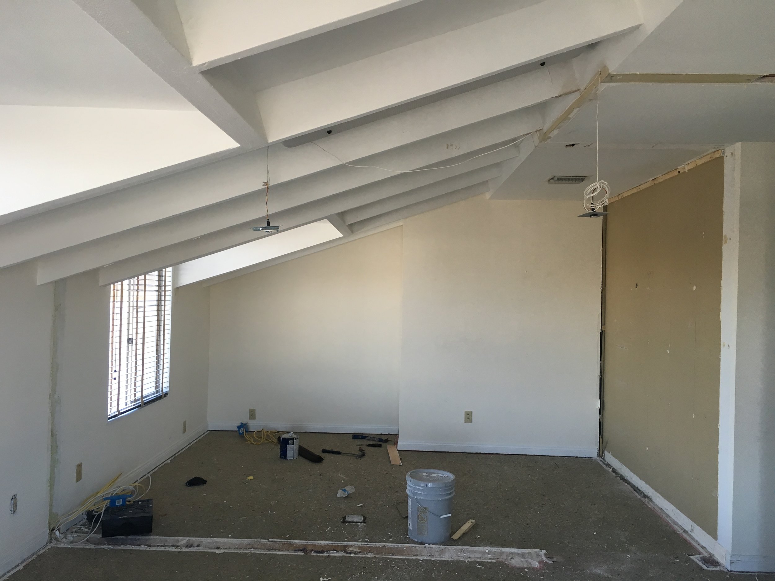
That said, I'd be lying if I said I didn't have some trepidation when first visiting the space. Here's what we were dealing with, folks:


To be clear, I do not know who owned and operated the space before Mike and his team took it over, but whoever they were, I doubt that even they were in love with the dark carpet, extremely dated finishes, the off-yellow walls and the hodgepodge of furniture. I was a pretty sad spot. No one should have to work in such a sad, sad office. Not on my watch, at least. This was getting remedied in a big way.
PHAse #1: Demo + Planning

When someone says they want to demo a whole space and build it back up in a month, there needs to be a good, healthy balance of thoughtful planning and a fly-by-the-seat-of-your-pants attitude.
When Mike reached out, he said he wanted the space to feel like a cool industrial loft. There wasn't time to split hairs, but right off the bat, I did have to level some expectations. You see, achieving an industrial loft look when your space is not in fact an industrial loft, is, well, pretty difficult to say the least. Rule #1** in design is to honor the bones of your building (if you can't change them). We didn't have soaring 20ft ceilings and exposed brick anywhere to uncover, but there are ways to achieve a look without making it look like you're trying too hard.
**By the way, I'm pretty sure that's not Rule #1. Rule #1 is probably something like, "Make sure it doesn't kill anyone!" but in this case, I stand by what I said.
You can also see that one of the things we could do, which is very loft-like, is break down some walls. The space pictured here needed to be a multi-purpose space for the kitchenette, work space, and larger groups. We looked at the spaces that were currently there and even at my first visit I was like, "see ya, wall, you gotta go." It felt SO much better when the space opened up.
You can also see from the left that we definitely pulled inspiration for the space from these loft-y images. Since the space is a Recovery Center, it did have to feel peaceful and calming. We can't inject a bunch of fire engine reds and primary yellows in the space if we want to be calm, know what I'm saying? I was definitely vibing with the blue-grey tones and deeper teals, however. Calm, but not boring. Refreshing, but not a smack in the eyeball. So that's what we went with.
Phase #2: selecting and purchasing
While super exciting things were going on like installing all new electrical (ha), we had a lot of choices to make. Thank goodness Mike is comfortable making quick decisions because we were flying between the flooring, carpet, paint, and - my personal favorite - wallpaper. Pro tip: always, ALWAYS, put your paint swatches up on the wall before purchasing a bunch of gallons and getting it up. Paint can look quite different depending on lighting and what else you have going on in the room from looking at paper swatches in the store. This is probably Design Rule #2 in my world. Because I knew the walls were going to be primed and painted a grey, I slapped them right up on the wall, but you can also by adhesive swatches you can paint and stick up like this.

Phase #3: Installation


Before we get to the good stuff, I don't want to overlook the amazing contractor and team Mike had to make this space truly come alive. Without people who can actually hang the wallpaper, install kitchen cabinets and even make an amazing custom bar from pretty much scratch, none of my fancy choices would be possible.
In fact, the bar wasn't even my idea. It was Albert's (seen hanging wallpaper on the left - a talented man). So, I can't even take credit for that. But the good news is, I've seen it done now and I know the guy to hire the next time around. And he'll do it for a very fair price, my friends. Just sayin'.
THE RESULT:
I almost can't believe what we were able to accomplish in such a short amount of time. The transformation is pretty incredible from the dark, crammed and dated space it was just a few weeks before, but that's what's possible when you've got a client who can make quick decisions and a badass team of contractors at your side.


If you have any questions about what you see, or if you need to create a cohesive and comfortable office space, get in touch.